02
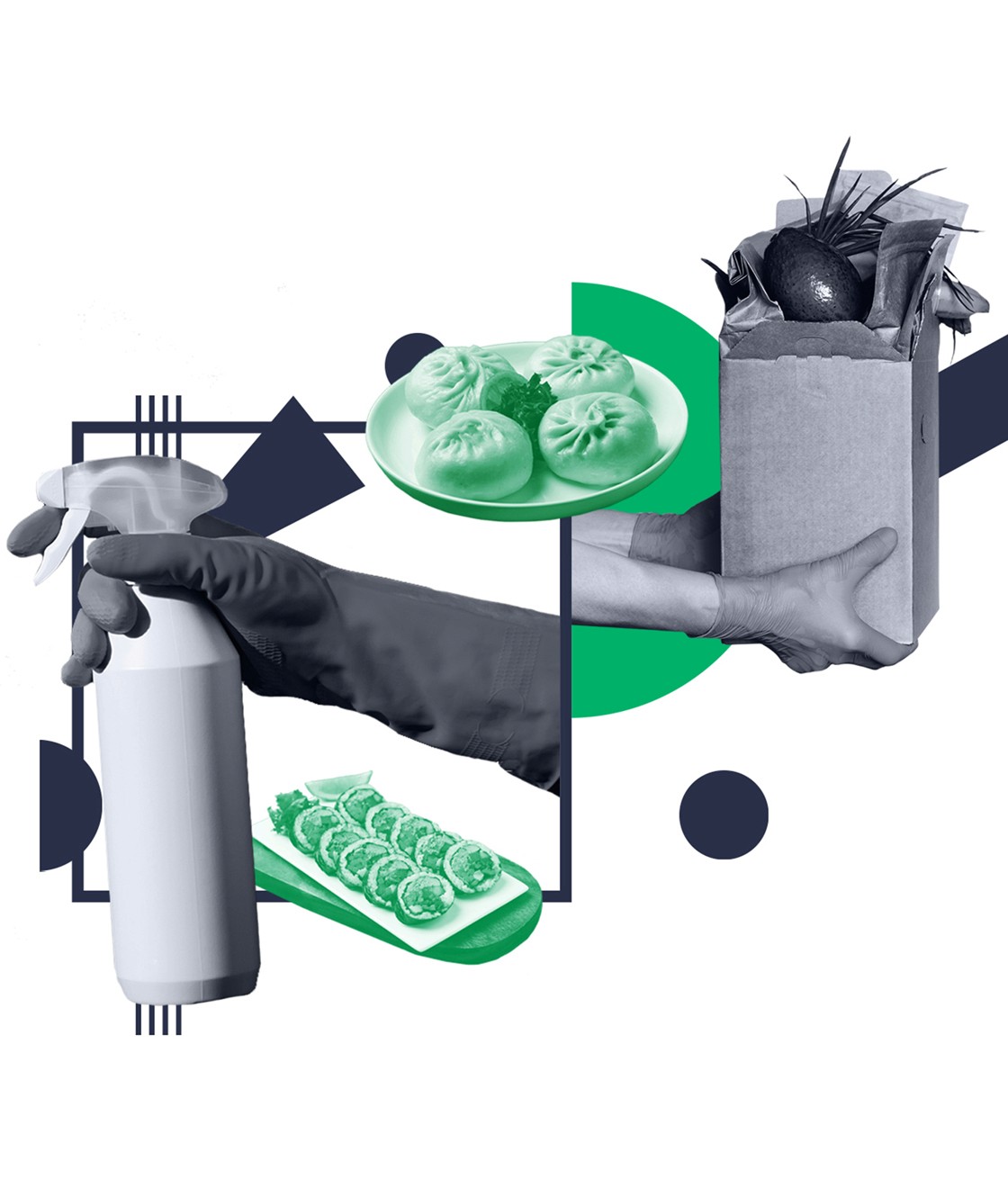
R_Keeper is a marketing platform for restaurants. As part of their content marketing efforts, my goal was to develop an illustration style for use in the blog and other external communications.
CLIENT
r_keeper
ROLE
graphic designer
year
2020
THE BRIEF
During the initial discovery with the client it was found that they prefer collage-style illustrations with these references: 1, 2, 3. All of the references had similar style, with illustrations being compounded from multiple objects into a single composition.
What made R_Keeper different from the platforms they listed as references is their limited color palette, which posed a challenge that was overcome by suggesting to always turn source images into duo-tones.
The proposed style was accepted by the client after the first iteration, without any changes.
© 2024


